

Finishes

Sage, mist, ink, and quiet neighbours

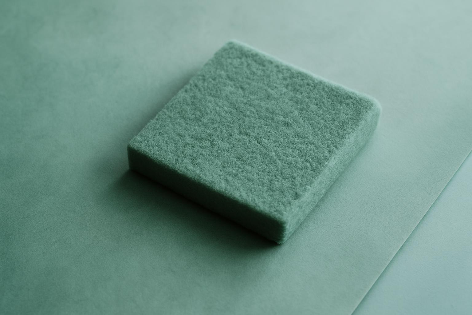
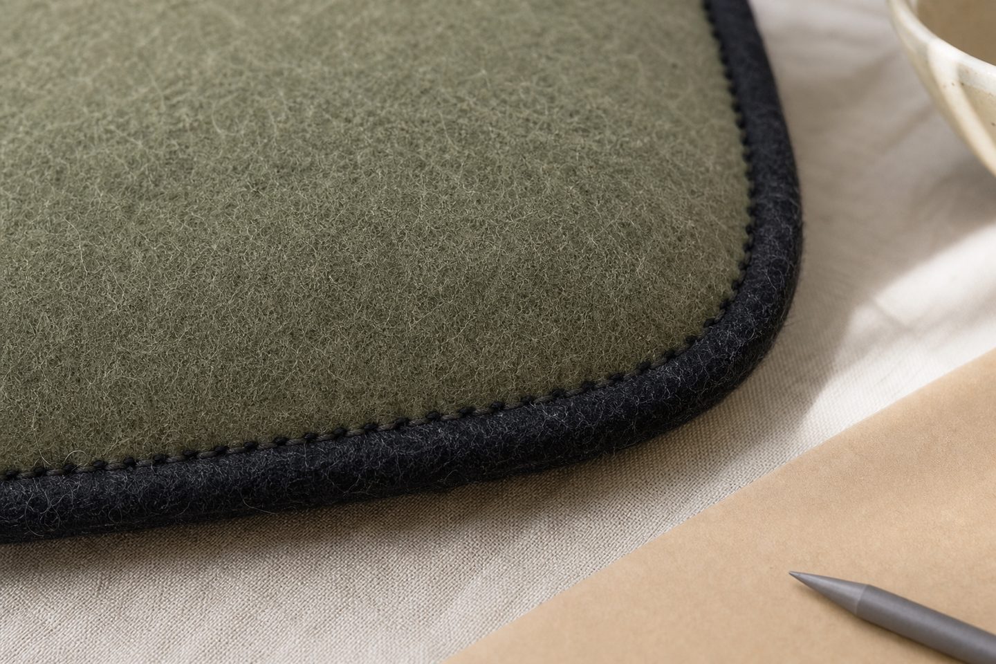
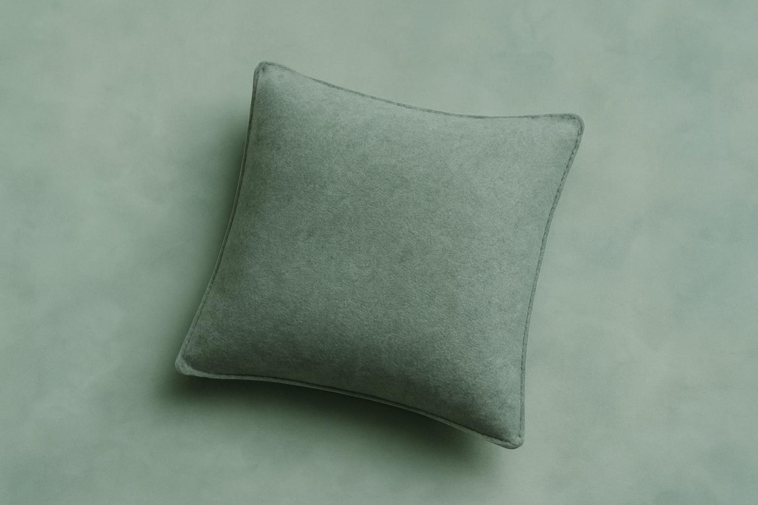
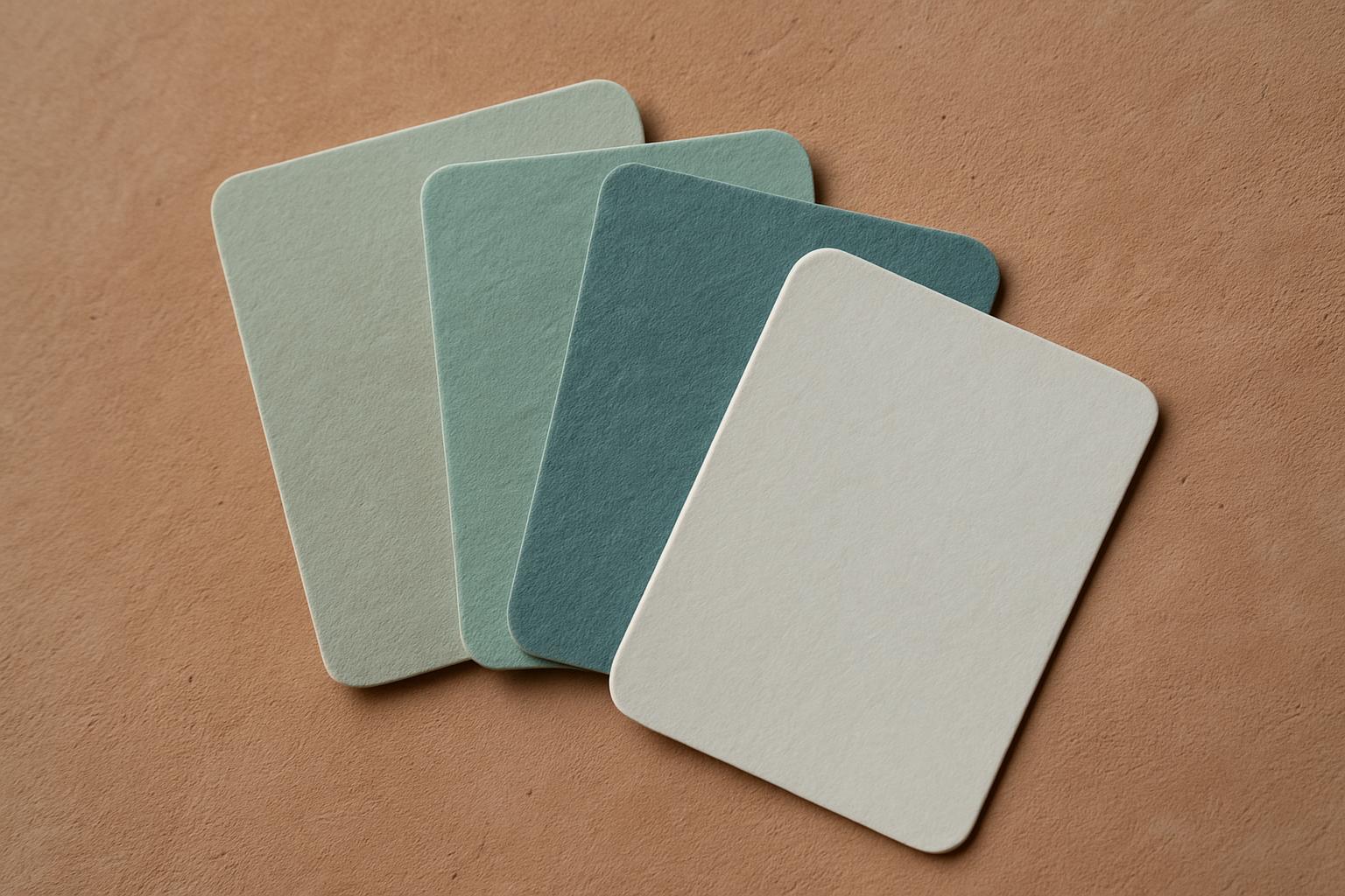
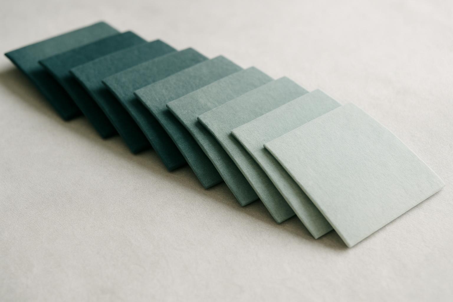
Our felt comes in ten finishes, from cool sage and soft greens to gentle neutrals and deep ink. Every colour shows a little differently depending on where and how you use it.

Our ten felt finishes for every field and edge

We offer ten colours chosen for South African spaces, from cool Sage Field and Soft Leaf to relaxed neutrals like Mist Paper, Sand Quiet and Clay Mute. Stone Wash and Cloud Pale bring soft highlights, while Ink Edge provides depth for piping, stitching and contrast. Forest Mute gives a quiet green suited to screens, and Teal Soft is reserved for subtle accents or hospitality piping.

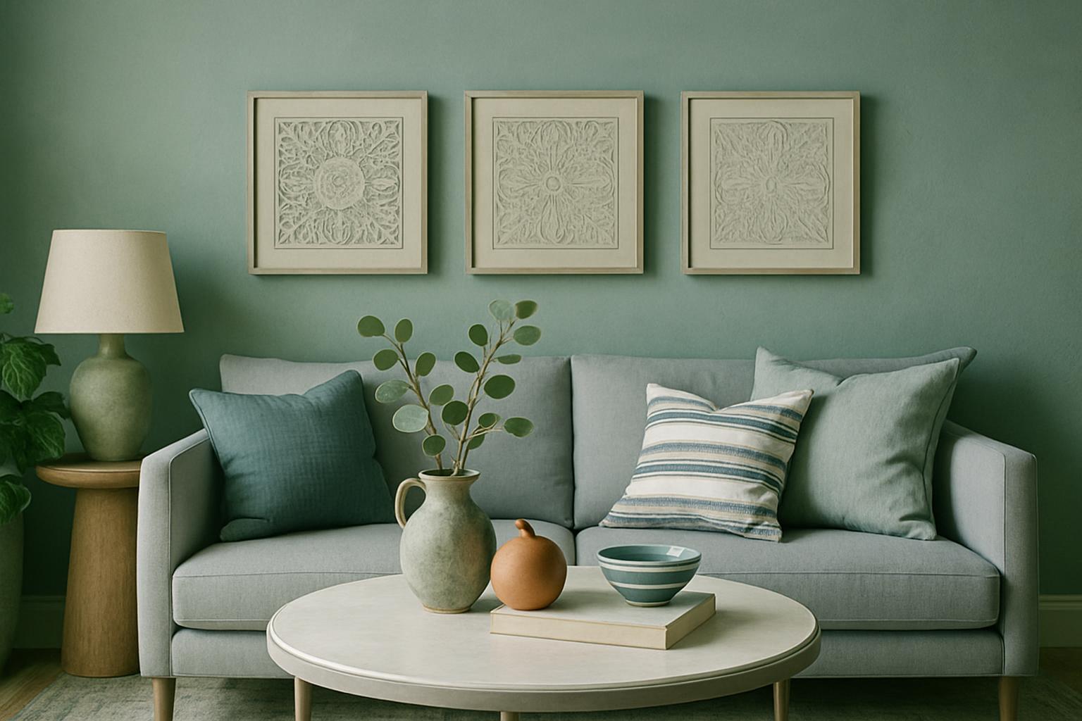
Most clients use one or two main colours for large fields, such as wall felt, runners or acoustic panels, then pick a deeper or lighter shade for edges, piping or accessories. You can mix finishes within one room or layer similar tones across a project for a gentle flow between spaces.

  • Sage Field: accent green for wall fields and piping
  • Mist Paper: warm neutral for light-filled spaces
  • Ink Edge: deep contrast for edges and hardware
  • Soft Leaf: green-grey for cushions and trays
  • Stone Wash: cool stone for calm highlights
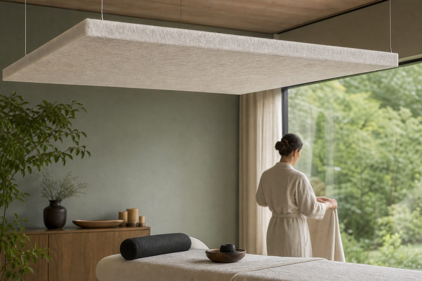
  • Cloud Pale: pale neutral for ceilings and spas
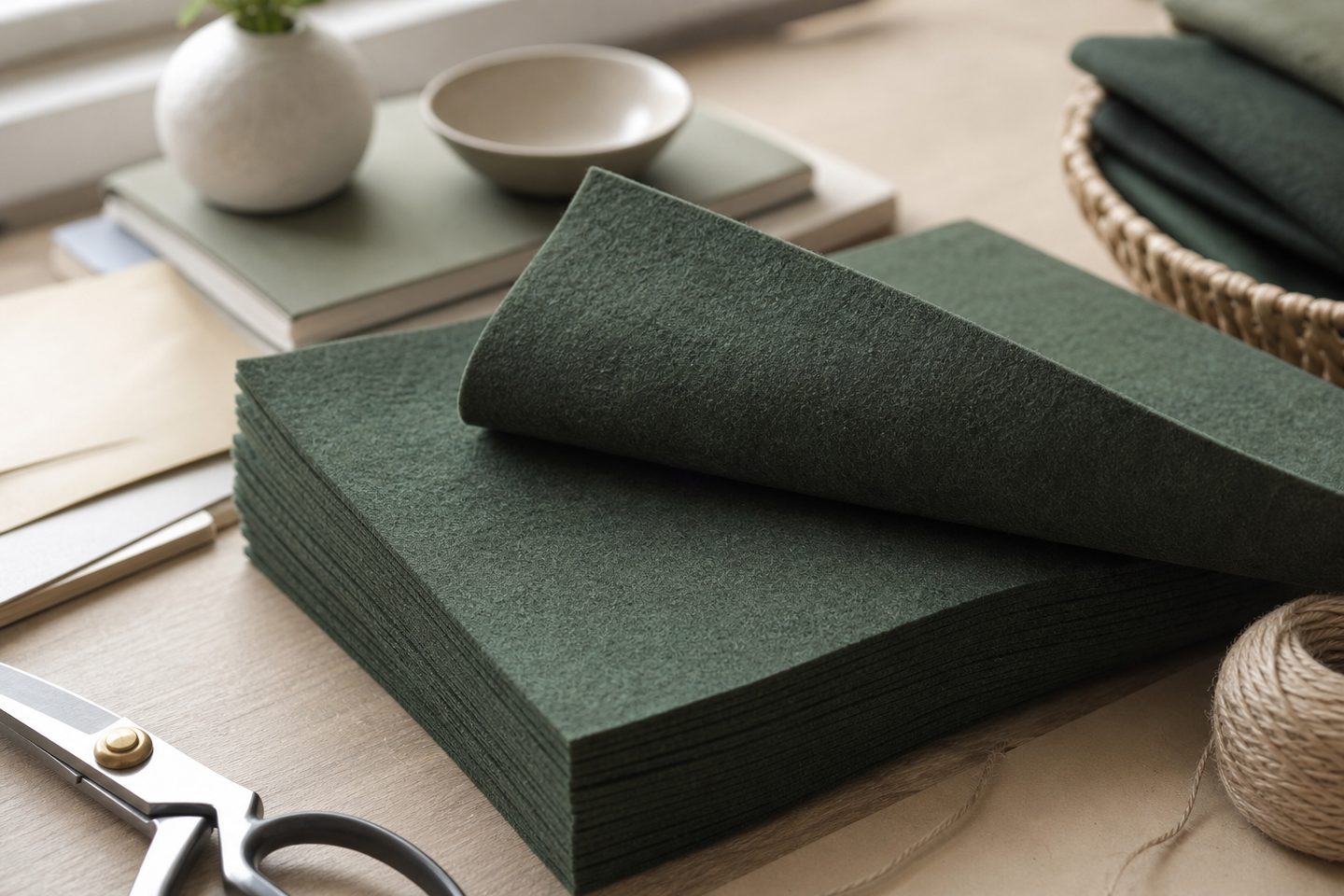
  • Forest Mute: muted green for screens
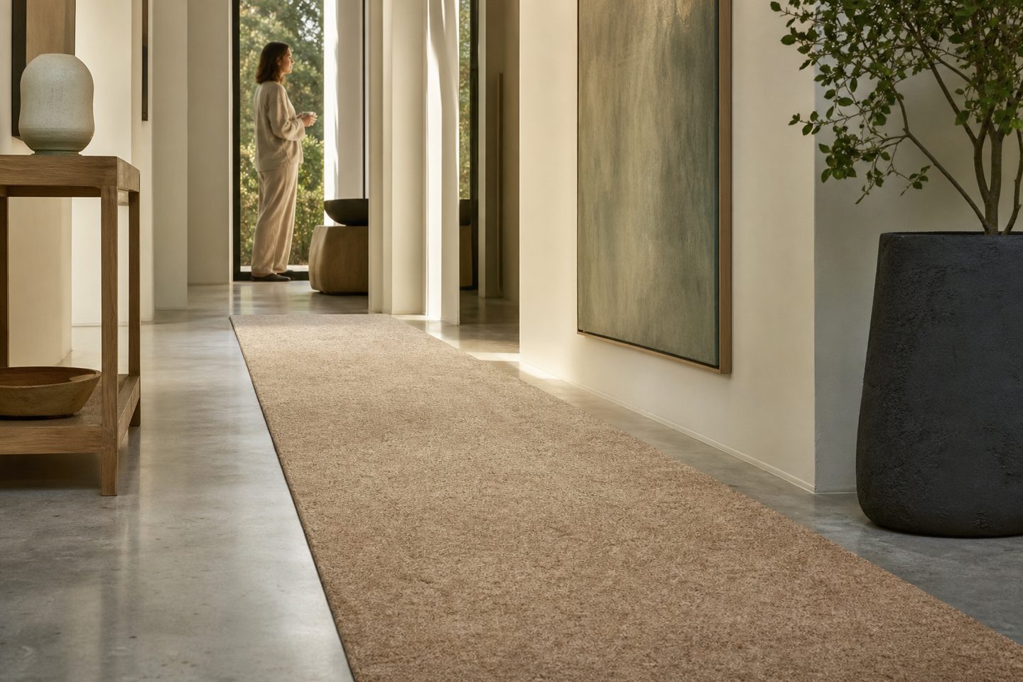
  • Sand Quiet: soft sand for runners and mats
  • Clay Mute: gentle clay for kitchens
  • Teal Soft: teal accent for selective piping
Light and colour in South African rooms

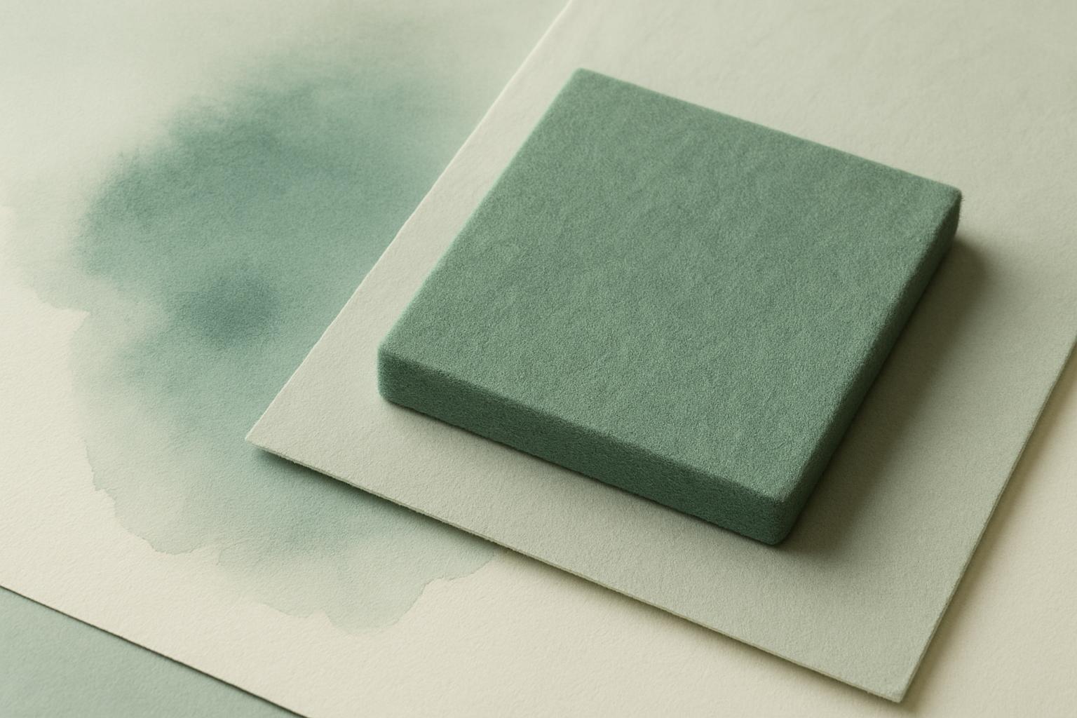
Felt colour shifts with its surroundings. On the Highveld, sunlight is strong and crisp, making Sage Field feel cooler and Ink Edge appear deeper. Coastal rooms, especially in Durban or Cape Town, soften greens and bring out warmer notes in Mist Paper or Clay Mute.

Try swatches in your own space over a few days. Place them near windows and on the floor or wall where the felt will sit. Overhead LEDs, morning light and even shadows from blinds can change the look. For homes with plenty of sun, remember that UV will fade dyed felt over time, especially near north-facing windows. We suggest rotating cushions and using blinds or UV film for protection.

How to borrow and judge swatches

You can borrow swatches from our Woodstock studio or arrange a set through our contact form. They travel easily in the post or with your designer, so you can compare all ten finishes side-by-side in your own room.

When you view a swatch, look at it under morning, midday and evening light. Place it next to your flooring, wall colour or furniture. Felt’s soft surface catches light differently to paint or laminate, so its colour may read warmer or cooler than you first expect.

Talk to Felt studio

Our contact form · Woodstock, Cape Town