Finish
Clay Mute is a gentle, muted clay shade, giving a warm, earthy paper tone best used as a subtle accent in farmhouse kitchens and similar spaces.
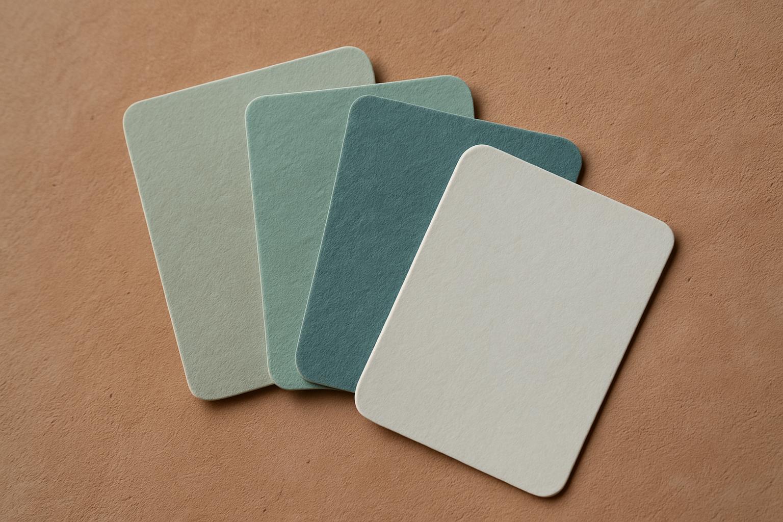
Muted clay paper for farmhouse kitchens, used sparingly.
Clay Mute appears as a warm, understated clay shade on our felt, with a calm, earthy undertone reminiscent of natural ochre paper. In bright daylight, its subtle orange-brown hue shows a gentle, powdery softness. Under lamplight, the colour deepens, picking up soft terracotta notes without turning harsh or yellowed.
The felt’s texture breaks up flat colour, making Clay Mute shift slightly depending on fibre direction and pile. Wool felt brings out more softness and a dry, mineral finish, while polyester acoustic felt can look a touch crisper and even. In both, the muted clay effect is restful, never loud.
We suggest Clay Mute for kitchens with natural timber, stone or pale painted cupboards, and for farmhouse settings wanting an earthy warmth without brightness. It works well on plinth wraps, window seat cushions and wall felt, especially where you want a quiet, settled base or edge.
Clay Mute can also break up cool neutrals in modern interiors, but we recommend using it sparingly, perhaps as a border, on banquette wraps in a café, or for stair nosing in a home passage. Its understated tone is calming in spaces that need softness and a grounded look.
To judge Clay Mute properly, always test a felt swatch in the room where you plan to use it. Natural and artificial light will change how the colour reads across the day. Place the swatch on the actual surface, near walls, floors or fabrics you want to match.
Clay Mute can fade over years if exposed to constant sun through glass. Rotate mats or use blinds or UV film to slow fading. Small differences are normal between dye lots: if you need perfect matching, order all pieces together.
Verified Google reviews