Press
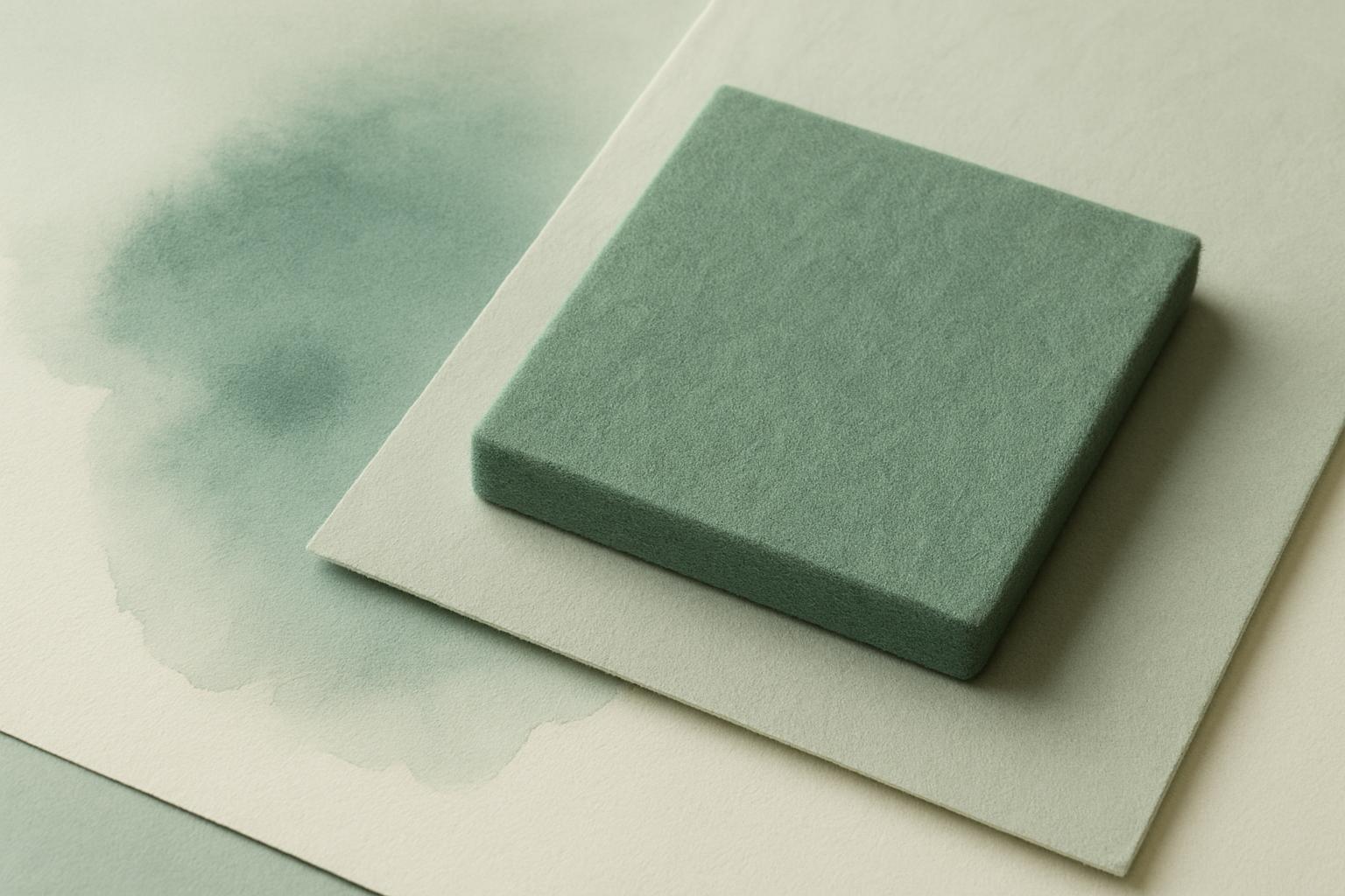
Our felt colour range is built around South African light: soft sage, cloud, mist and ink tones that work for living, working and learning spaces year-round.
Our felt colourways, Sage Field, Mist Paper, Ink Edge and their subtle companions, reflect a practical response to the South African environment. These shades are gentle on the eye under strong sunlight and suit both busy and calming interiors.
We test every colour sample in our Woodstock studio and at our Johannesburg and Durban showrooms to check how it sits in natural and artificial light. The result is a set of hues that hide scuffs and dust, weather well by sunny windows, and look welcoming in homes, clinics, offices or cafes.
Strong UV and shifting daylight change how colours read from morning to evening, especially on the Highveld or along the coast. Deep greens like Sage Field soften glare, while Mist Paper and Cloud Pale keep spaces calm and easy to match with wall paint, timber and stone.
Ink Edge and Forest Mute bring depth without making public spaces feel heavy. In clinical or teaching settings, these tones help with focus but avoid bright, distracting contrasts. For busy households or foot traffic, the in-between tones like Stone Wash and Sand Quiet do not show marks easily.
Our felt colours are chosen with real use in mind. Lighter shades do fade near sunny windows, so we suggest rotating entry mats, window seat cushions or trays, and using blinds or UV film in high sun areas.
Every piece of felt is cut from non-woven textile, so its colour stays even at the edge and does not fray. Soft, muted colours help disguise everyday dust and keep cleaning simple, whether in a busy school corridor or a hotel lobby.